Designing for 10M+ Users at Deutsche Telekom
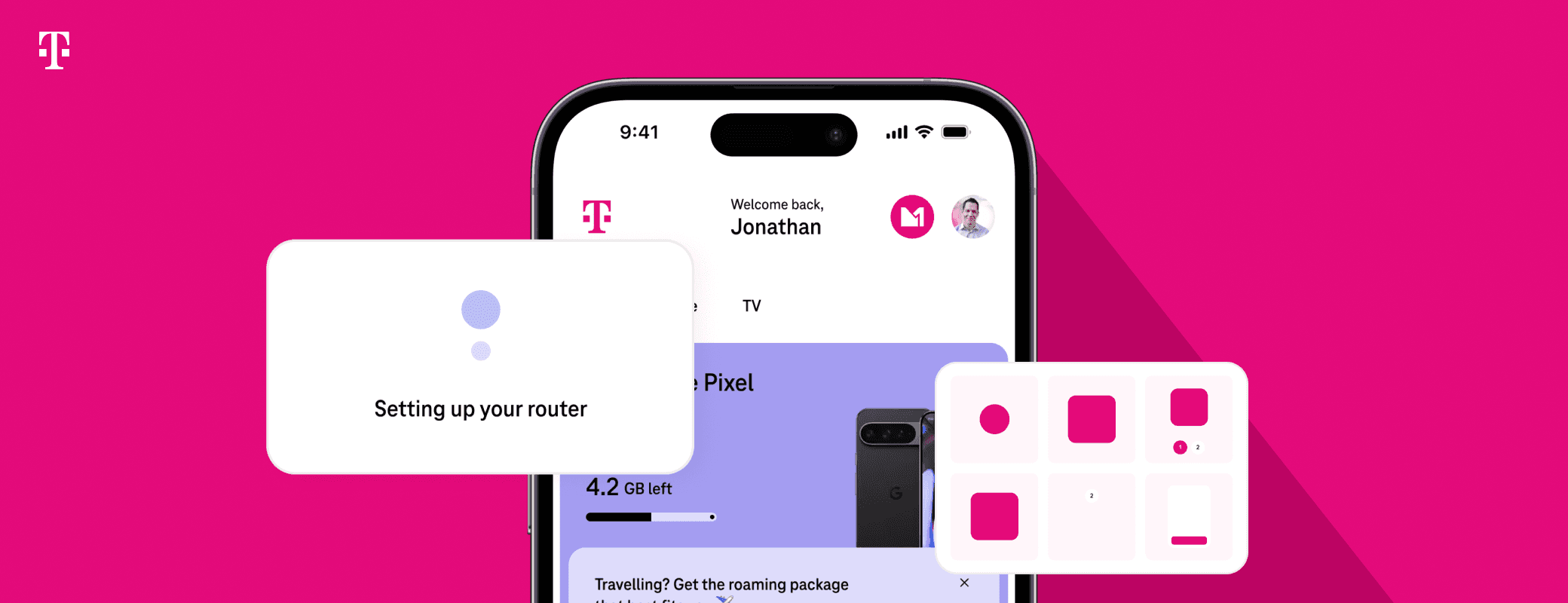
Built a scalable design system UI used across Mobile & Home products

Redesigned the filter experience to drive a 20x increase in adoption and improve user satisfaction.

Redesigned the filter experience to drive a 20x increase in adoption and improve user satisfaction.

ⓘ The All projects of Deutsche Telekom is under NDA. I'd be happy to share the full story during an interview!

My Role :

UI/UX Designer

Location:

Berlin, Germany (Onsite)

My Daily Work

My Daily Work

As part of the Design & Customer Experience team, I spent my days turning complex requirements into intuitive designs (and a lot of sticky notes into user flows). I supported the team in every stage of the design process - planning usability tests, validating concepts with data and user feedback, creating use cases, user stories, and prototypes - while ensuring everything aligned with the design system. From refining interfaces to brainstorming better customer journeys, my role was about making every click and interaction feel effortless for the user (and not just look pretty on a slide).

As part of the Design & Customer Experience team, I spent my days turning complex requirements into intuitive designs (and a lot of sticky notes into user flows). I supported the team in every stage of the design process - planning usability tests, validating concepts with data and user feedback, creating use cases, user stories, and prototypes - while ensuring everything aligned with the design system. From refining interfaces to brainstorming better customer journeys, my role was about making every click and interaction feel effortless for the user (and not just look pretty on a slide).


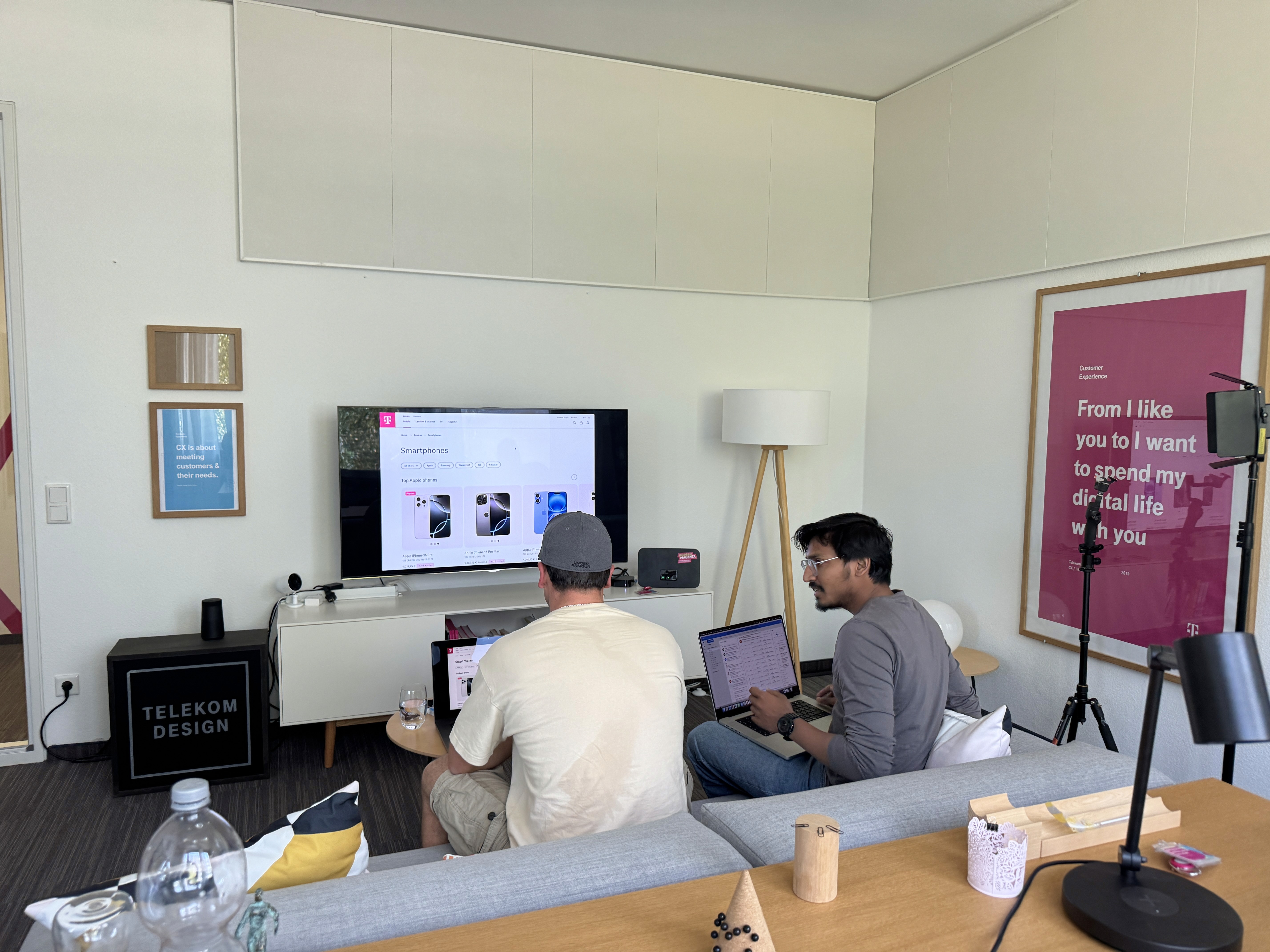
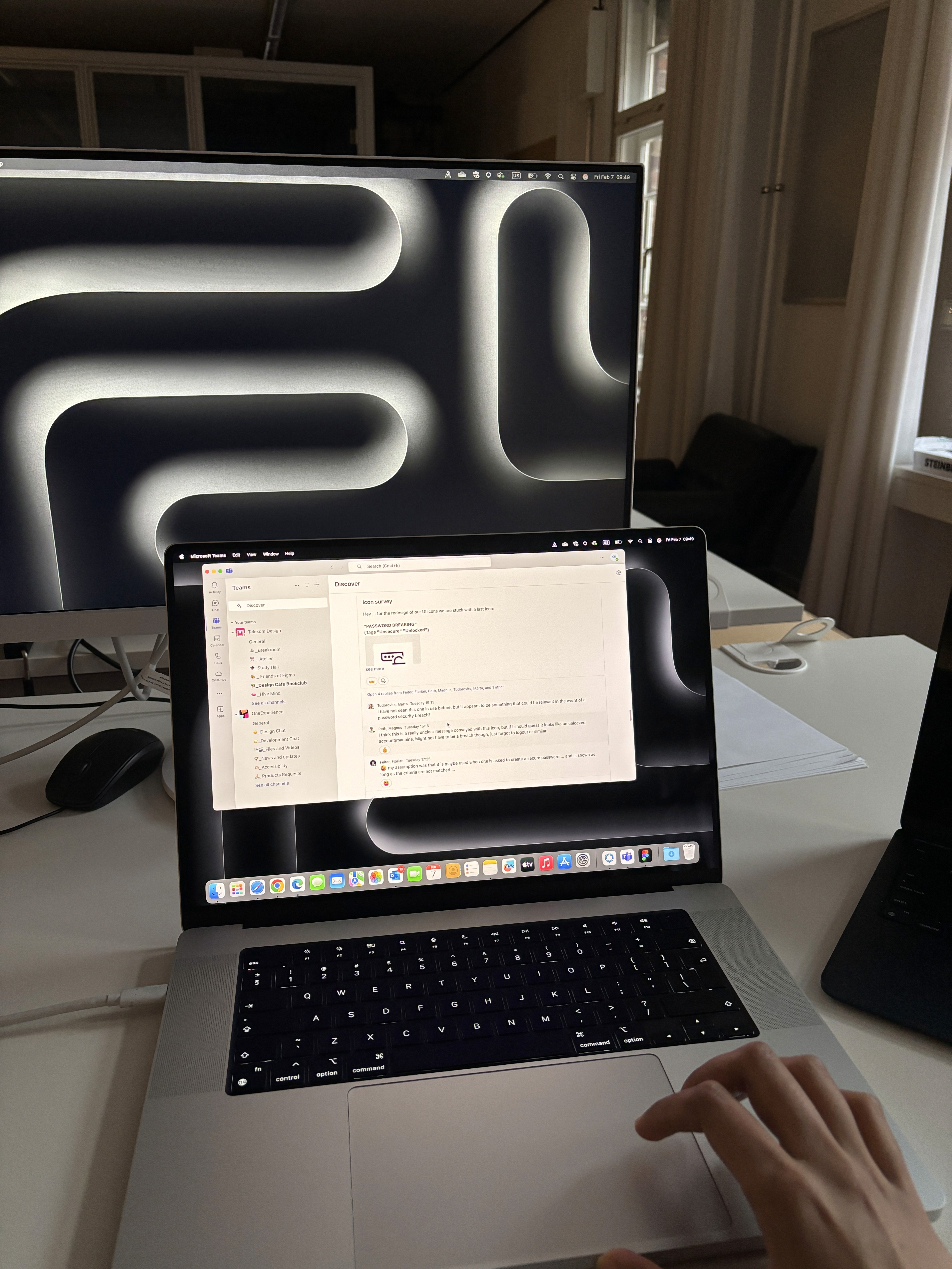
A glimpse into a typical day at Deutsche Telekom, Berlin!

A glimpse into a typical day at

Deutsche Telekom, Berlin!

My Telekom Projects:

My Telekom Projects:

My Telekom Projects:

01

Telekom's Design System - Motion Design

02

E-Commerce 2.0 - Customer Journey

03

Speedport 7 - Customer Experience

01

Telekom's Design System - Motion Design

To improve motion design across Telekom’s digital products, we conducted a deep dive into user needs and industry gaps. We identified key pain points through peer feedback, and competitor research. Our goal was to define system-level animation principles that are accessible, consistent, and feasible for implementation.

Design Process :

Design Process :

Design Process :

Discover & Define:

To improve motion design consistency across Telekom’s digital products, we defined clear objectives and gathered materials including industry benchmarks and competitor analysis to identify gaps and opportunities. Peer reviews and feedback sessions uncovered key user pain points in current transitions. Combined with internal alignment, this helped prioritize screen animations by user impact and technical feasibility.

The result: a focused problem space and initial hypotheses for system-level animation principles that are consistent, accessible, performant, and developer-ready.

Defining Design Principles :

Defining Design Principles :

Defining Design Principles :

01

Clarity

02

Consistency

03

Accessibility

04

Feasibility

We then defined a library of transitions - for screens, modals, states, and feedback interactions. Each was designed with intent and tested with real users.

Motion System Design Examples:

We developed and refined over 30+ transition & Motion principles as part of this initiative. Due to confidentiality constraints, we’re only showcasing a few key examples such as slide-in/out transitions, card expansion, and progress/loading states to illustrate the type of work we did. This preview represents a small portion of the comprehensive motion guideline system we created to address Telekom’s earlier inconsistencies.

User Testing:

User Testing:

User Testing:

We conducted user interviews with 16 participants and assigned them three tasks: data recharge, setting up a router, and purchasing a phone from our website. Through these sessions, we gained valuable insights and feedback.

Key Learning:

  • Accessibility should be in the process not at the last stage.

  • Make product that easy to use not just looks good to eye.


  • Collaborative understanding of different approach & feedback gives better quality

02

E-Commerce 2.0 - Customer Journey

Improved the end-to-end customer journey across key touchpoints such as tariff and device purchases, and many more, for logged-in, logged-out, and new customers. Collaborated with teams to define core principles and streamline interactions, aiming to create a more intuitive, seamless, and satisfying digital buying experience. This project is highly confidential and still in progress. Some changes were made prior to internal discussions, so I am unable to disclose further details publicly.

03

Project 3 : Speedport 7 - Experience

Enhanced the router setup experience by improving moments when users wait for Speedport 7 to connect. Designed helpful and engaging UI elements to reduce user frustration, build trust, and make the waiting phase more meaningful and user-friendly.

Problem Overview:

Problem Overview:

Users cannot accurately gauge how much time a process will take by just looking at visual cues, leading to confusion and frustration.


This highlights a critical issue: "Unclear communication of process progress causes user distrust and drives them away before completion."

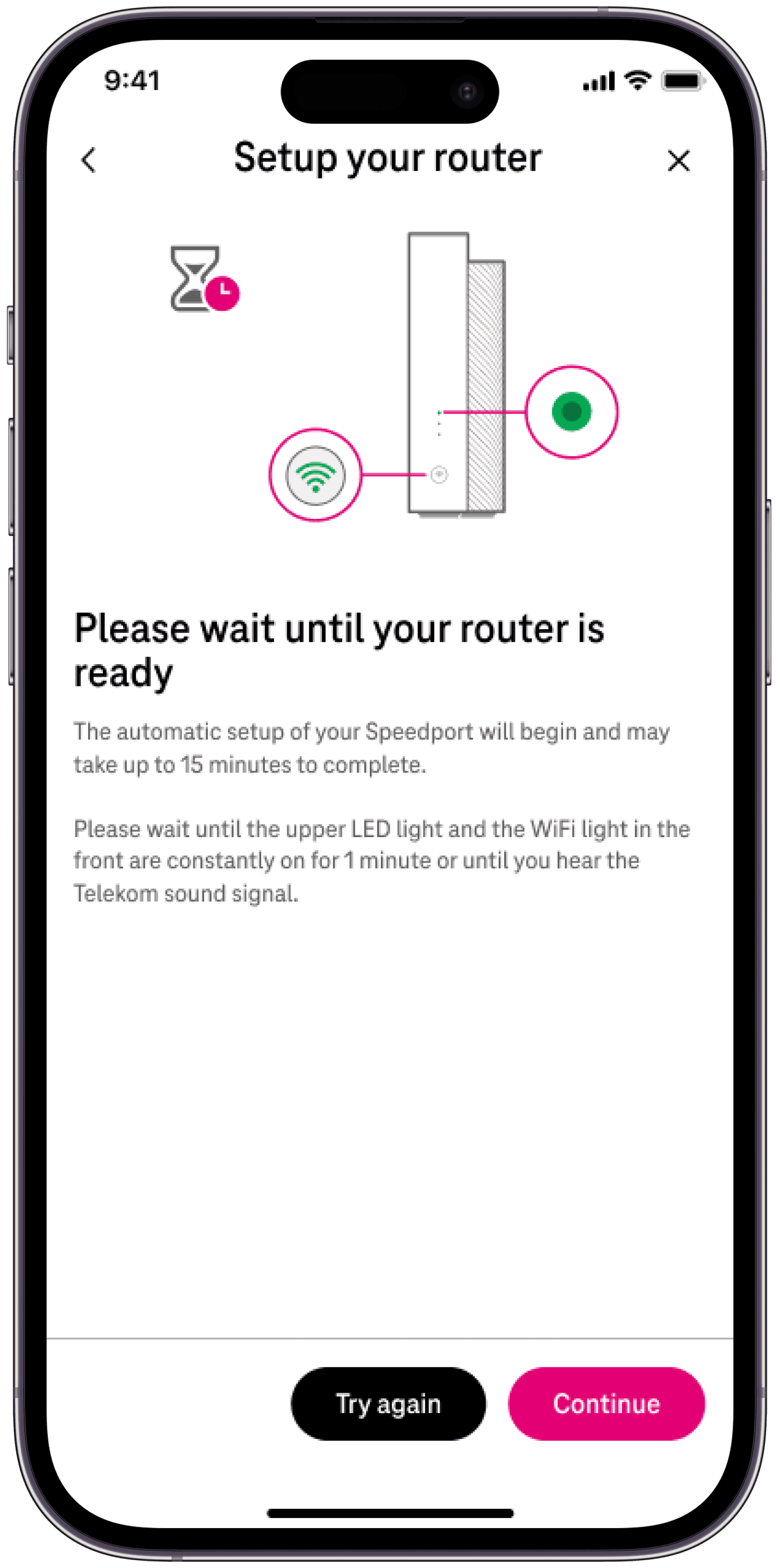
Making Blinking Easy to Understand and Follow

Making Blinking Easy to Understand and Follow

Making Blinking Easy to Understand and Follow

We created a syncing animation and clear messages so users can easily see when their device is ready.

How I Made the Animation

We couldn’t get the exact time the product blinks. So, we made a blinking animation in the app that looks like it blinks at the same time as the real product. This makes users feel the app and the product are working together, even if the blinking isn’t perfect.

How I Fixed the Timing Message

Instead of saying, "Please wait until your router is ready," we integrated the message into the animation itself, which grabs the user’s attention. This way, users can watch the blinking and know exactly when to move on, making it easier to understand.

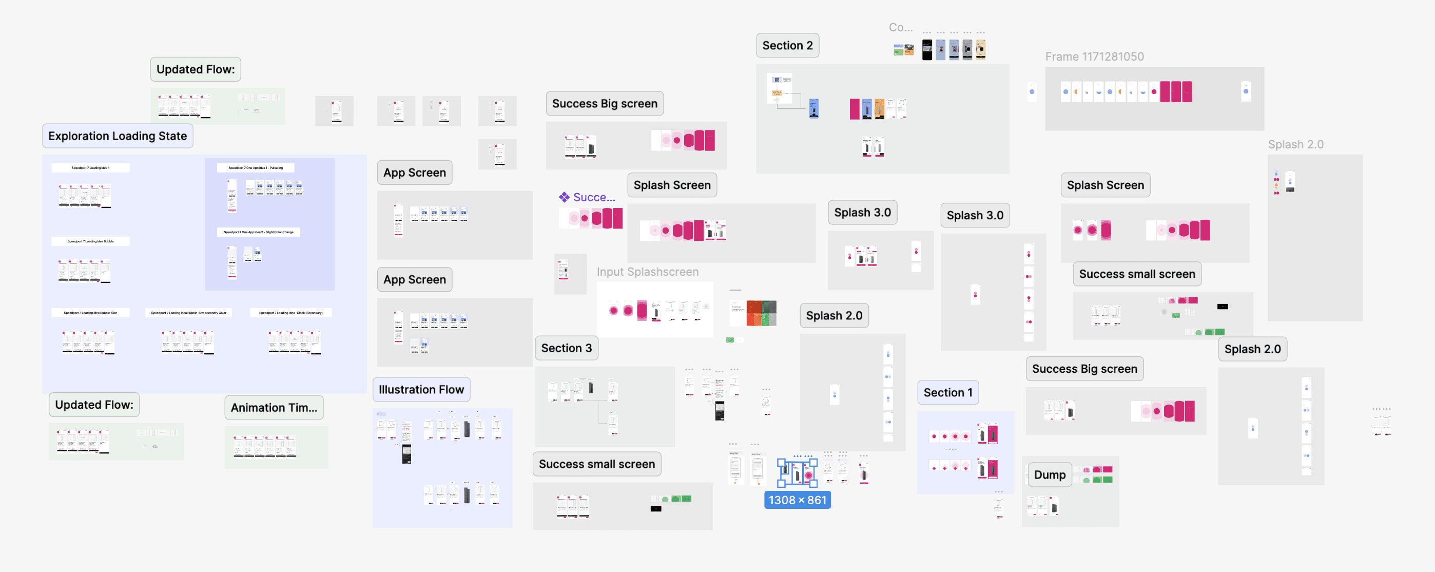
After multiple rounds of ideation and wireframing, along with a deep understanding of the requirements and how the router syncs with the device, we explored many suggestions and ideas. Through careful evaluation and internal team discussions, we finalized three MVP concepts that align well with the brand’s style and logic. These MVPs have proven to work effectively and set a strong foundation for the next steps. Below, I have attached some rough ideation we did to address the problem.
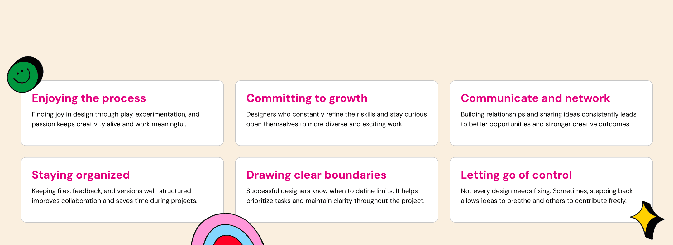
Personal Growth & Learning at Telekom

Made with love ❤️

Made with love ❤️

Made with love ❤️

Discover & Define:

To improve motion design across Telekom’s digital products, we initiated the project by clearly defining objectives and assembling all necessary materials. This phase included benchmarking industry standards and analyzing competitor approaches to identify opportunities and gaps.


We conducted peer reviews and gathered feedback to understand current user pain points related to motion design. These insights, combined with internal alignment sessions, enabled us to identify the required types of screen transitions and prioritize them based on user impact and technical feasibility.


The outcome of this phase was a well-defined problem space and a set of early hypotheses to guide the development of system-level animation principles that are consistent, accessible, and implementation-ready.

Discover & Define:

To improve motion design across Telekom’s digital products, we initiated the project by clearly defining objectives and assembling all necessary materials. This phase included benchmarking industry standards and analyzing competitor approaches to identify opportunities and gaps.


We conducted peer reviews and gathered feedback to understand current user pain points related to motion design. These insights, combined with internal alignment sessions, enabled us to identify the required types of screen transitions and prioritize them based on user impact and technical feasibility.


The outcome of this phase was a well-defined problem space and a set of early hypotheses to guide the development of system-level animation principles that are consistent, accessible, and implementation-ready.

Create a free website with Framer, the website builder loved by startups, designers and agencies.