Increasing Search & Filter Adoption from 0% → 20%
User-Centered Redesign for Student Accommodation Search
B2C
SaaS
UX Strategy
THE PROBLEM & EVIDENCE
Search and filter design blocked efficient property discovery.
Three interaction issues were measured to quantify search success, filter engagement, and abandonment risk. Results showed that poor search + hidden filters created the most friction for students.
I analyzed 180+ user sessions, reviewed 30+ support tickets and listen to student and sales team call recording, and conducted 4 quick interviews with the support team. The data showed search and filtering weren't just broken - they were actively preventing discovery. key problem screen by screen
01
Search Entry Point

20%+ searches outside UK
Trust signals below the fold
No global intention
→ Low user engagement
02
Results Exploration

UK-only results limited discovery
Abrupt keyboard behavior broke flow
Multiple taps for key decision making
→ Early dropoff
THE STRATEGY & APPROACH
Redesign the complete search journey not just one piece.
The problems were interconnected. Bad search meant users saw irrelevant results. Hidden filters meant they couldn't refine those results. Fixing one without the other wouldn't work. The strategy: Make search globally accessible and filters progressively visible. Data showed 85% of users needed only three filters but they needed global city search first. This wasn't about adding features. It was about redesigning the entire discovery flow to match how international students actually search.
Key Trade-Offs (Intentional)
✅ What I Did
❌ What I Didn't Do (And Why)
Global city search
No personalization (time + data constraints)
Prioritized top 3 filters
Avoided deep filter trees (cognitive overload)
Reused familiar patterns
No experimental UI (timeline + risk)
Improved visibility
No advanced sorting logic (out of scope)
THE SOLUTION
The Complete Search Journey
The solution addressed both problems as a cohesive experience: global search to find cities, visible filters to refine results.

Part 1: Global Search Experience
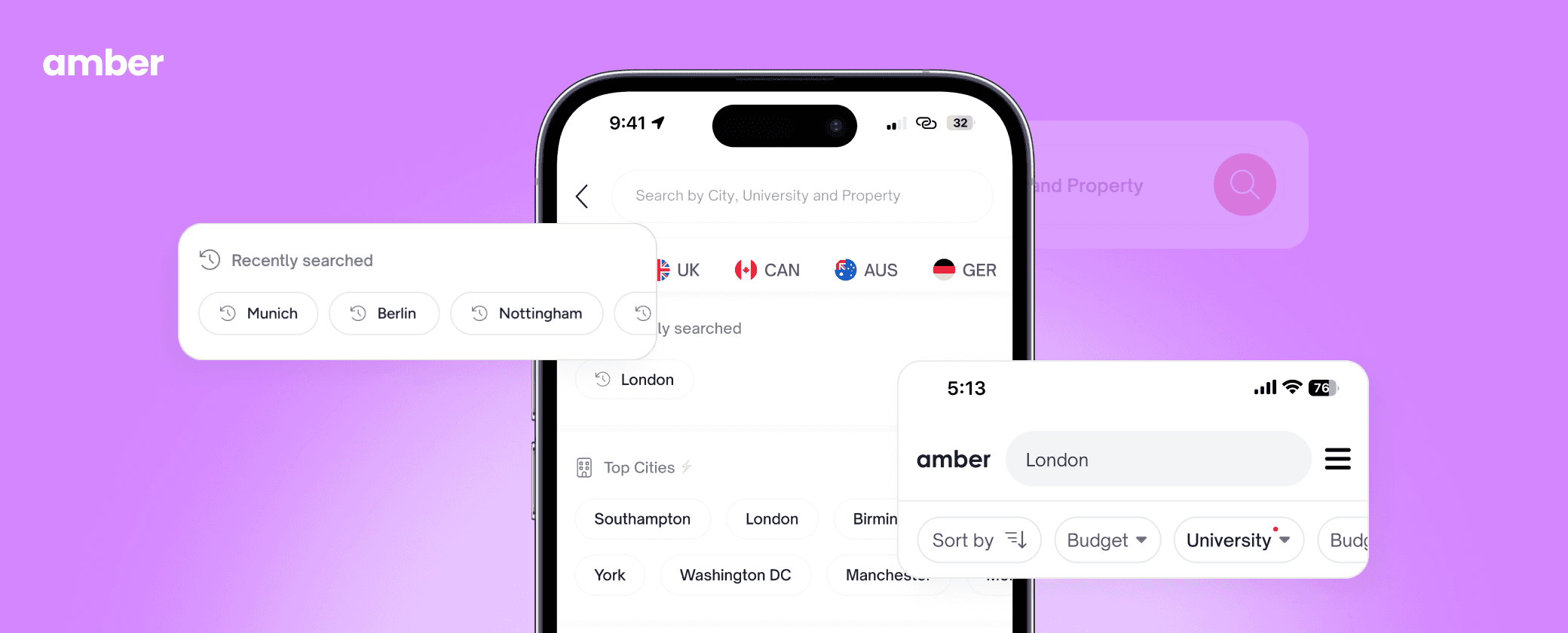
Changed search from UK-centric to globally accessible. Added autocomplete for 250+ cities worldwide. Created clear distinction between city-level browsing ("Find cities") and property-level search ("Search properties"). Popular destination suggestions helped users discover options. City autocomplete appeared after 2 characters typed. All results showed clear geolocation: "London, UK" vs "London, Ontario."
Before
UK-only, London, Glasgow, …
Visual clutter hid primary actions
No autocomplete, Manual Typing Only
Abrupt keyboard behavior broke flow
↓ Low User Engagement
After

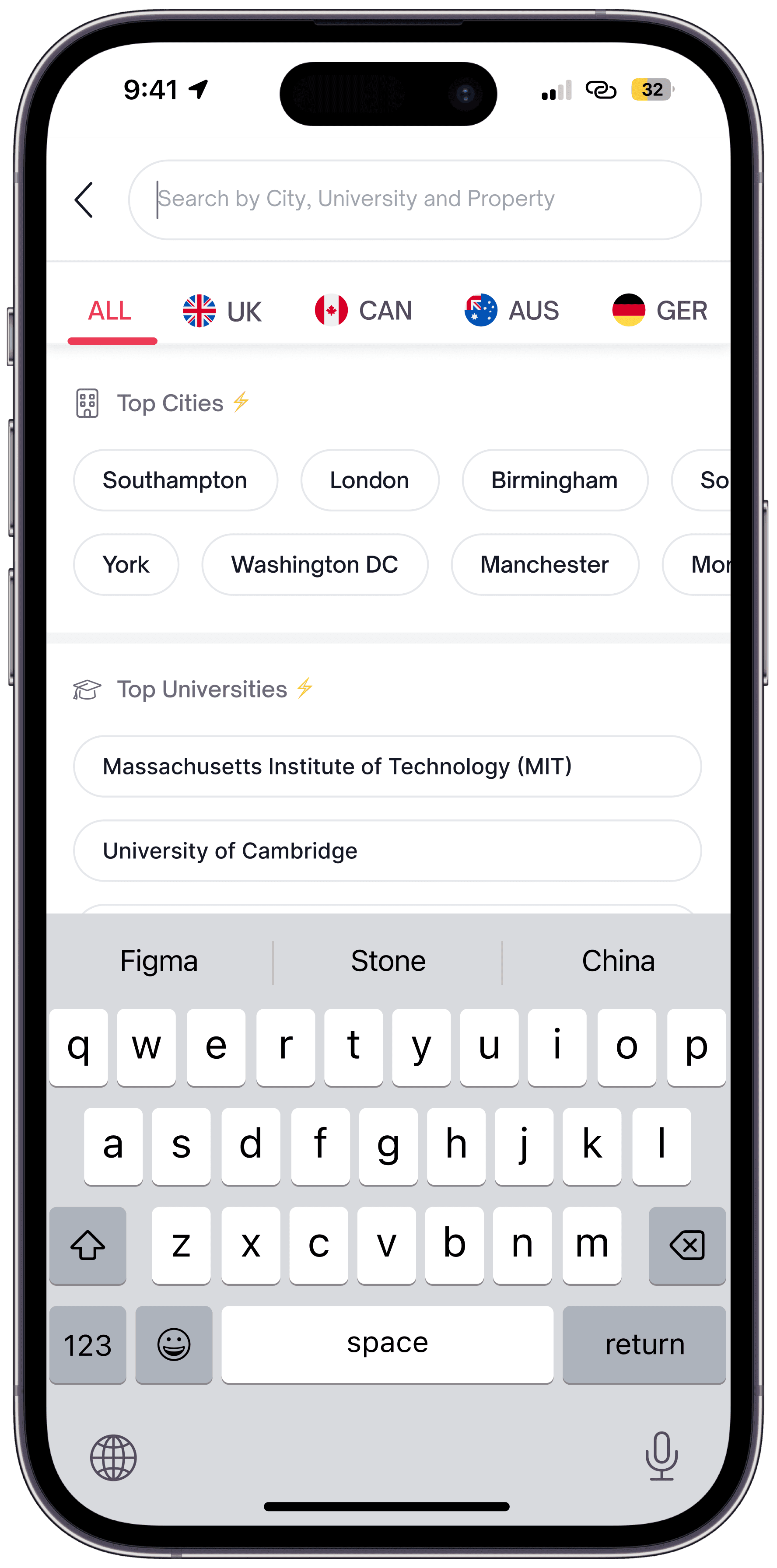
Global cities and countries (7+ countries, 100+ cities)
Clear visual hierarchy
Error states that guide, not block
WCAG-compliant touch targets
↑ 184% increase in User Engagement
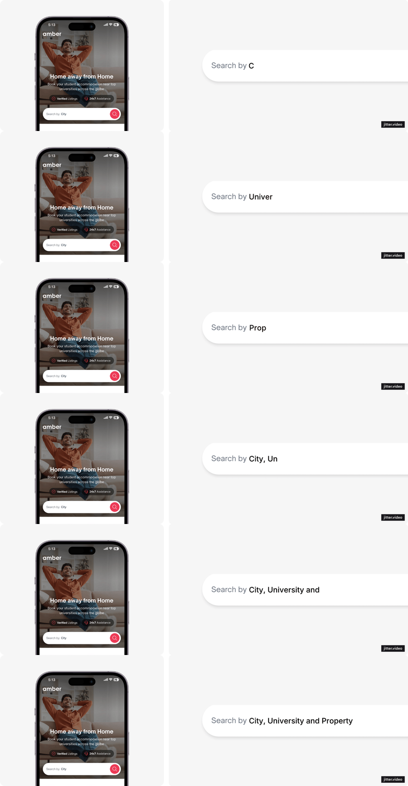
International users could explore unfamiliar locations confidently, without guessing what to type.
Part 2: Progressive Filter Visibility
Below are some iterations that helped determine which features to prioritise. I prioritised filters like budget and move-in month based on user demand, since students typically search using these criteria. After the release, we saw a noticeable increase in filter usage, which significantly improved the overall user experience.
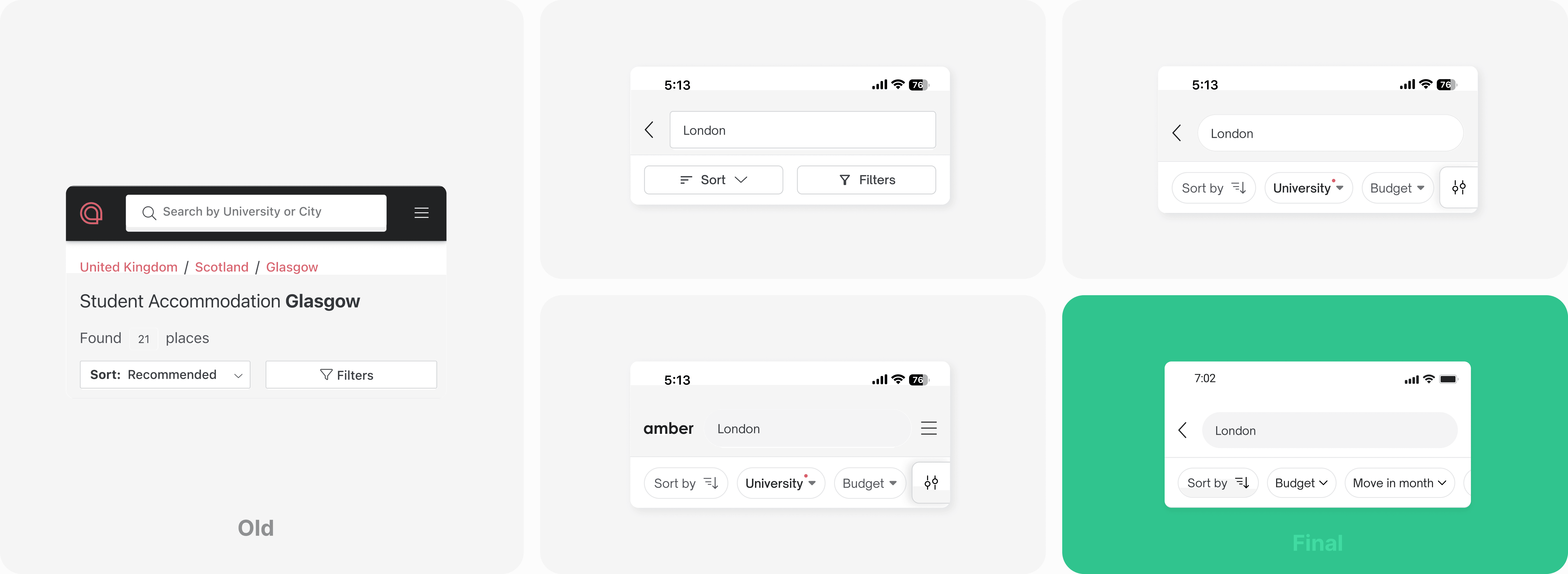
Made the top 3 filters always visible as tappable chips: Budget, Available From, University Proximity. These covered 85% of filtering needs. Added "All Filters" button for power users who needed comprehensive options.
Included dynamic count: "ex: 47 properties match" before applying. Created clear active state with removable filter chips.
Before


High cognitive load
Dynamic count not updating in real-time
High Scroll depth - important filters were buried.
No Quick filters, Low decision making
↓ ~0% Filter Adoption
After
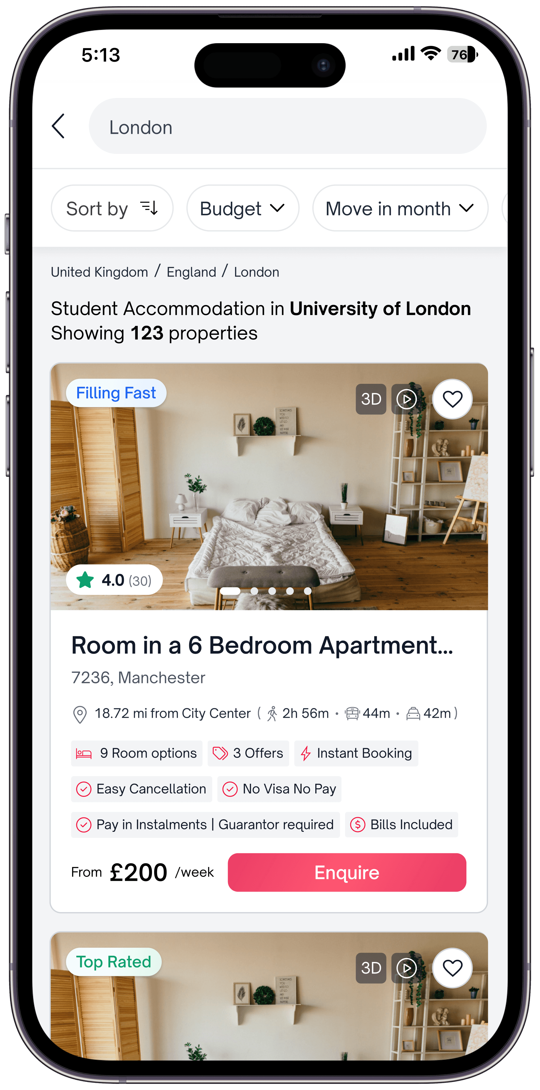

Reduced cognitive load
Dynamic Count easily visible
No scroll depth - visible upfront
Quick filters, Faster decision making
↑ ~0% to 25% increase in Filter Adoption

Improved the search experience by supporting repeat users, providing helpful error guidance, and offering real-time suggestions to reduce friction and improve search accuracy.
The Complete Search Journey
The redesigned experience flows naturally: Students search for a city globally → See relevant properties → Refine with visible filters → Book confidently. Each step removes friction from the previous design.


Users shifted from passive scrolling to intentional refinement. 70% only needed the 3 quick filters.
Outcome
↑ ~0 → 25%
Filter Adoption
↑ Increase
International User Engagement
↑ Decrease
Early Dropoff

Reflections:
I learned that meaningful impact doesn’t always come from large-scale redesigns. Small, focused UX improvements when grounded in real user behavior can deliver significant business value. This project taught me the importance of working within constraints and using a focused MVP to validate ideas quickly. By aligning user needs with business goals, a simple solution proved more effective than a complex one, reinforcing the value of clarity, intention, and iteration in design.
