
Optimized
Property Page
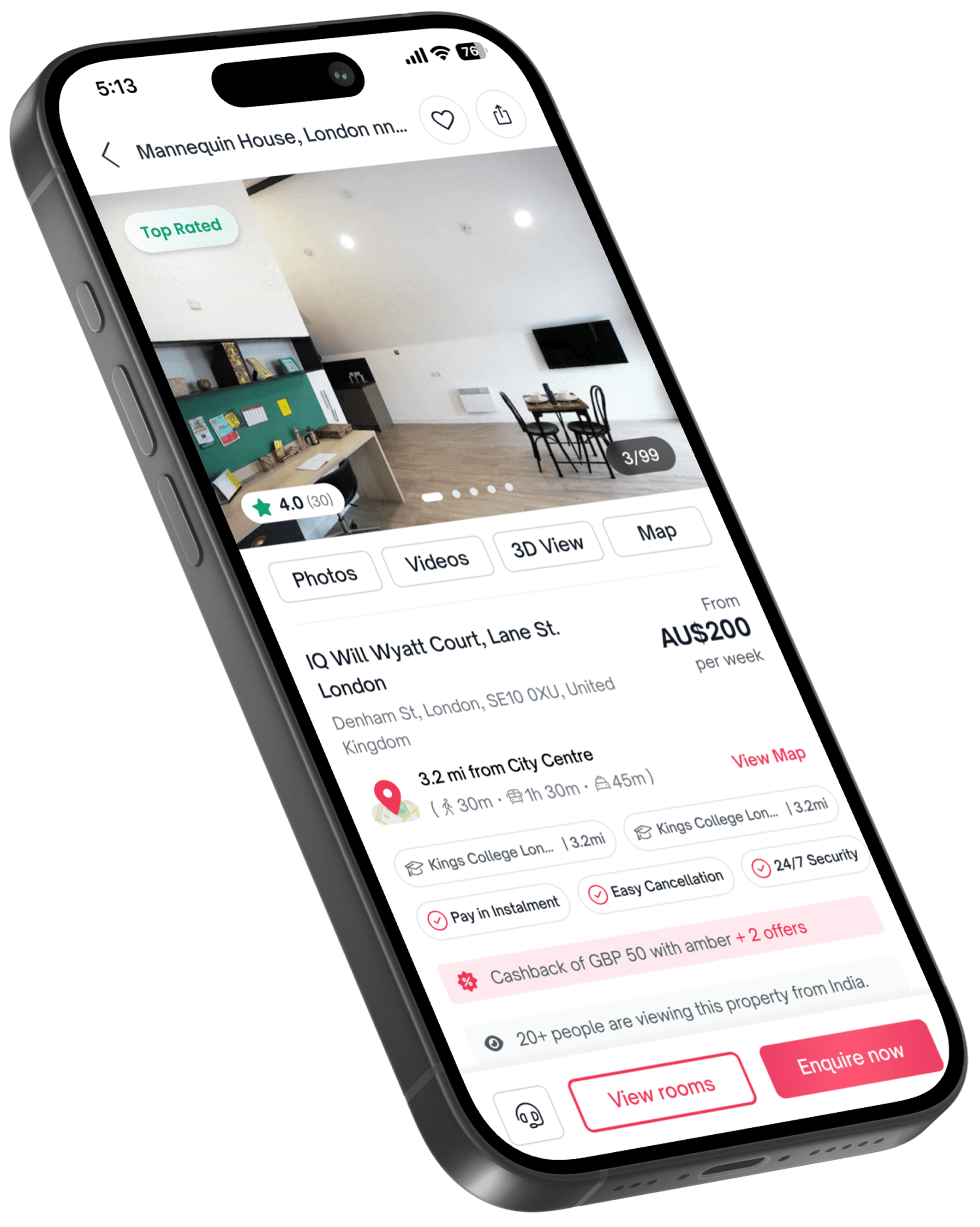
My Role :
Led the end-to-end design process from user research to final implementation, including competitive analysis, heuristic evaluation, and multiple discussions, while collaborating with product and engineering teams.
Team Structure :

Impact :
Redesigned the Property Page experience, resulting in over 110% spike in engagement at launch and a sustained 30% increase in traffic. The new custom page saw strong adoption, growing from zero to 74K peak views, successfully replacing the old version.
Project at a Glance 👀
Amberstudent provides student housing services, offering verified listings for student residences, private halls, and shared apartments near universities. The platform simplifies the search and booking process by assisting students throughout.
The project aimed to redesign the property page for a cleaner, more intuitive experience that highlights key information upfront - enabling students to make faster, more confident housing decisions and ultimately increasing lead conversions.
The Problem :
The property page on AmberStudent was cluttered and unintuitive, making it difficult for students to quickly find essential information like pricing, room types, and location. This led to user frustration, increased drop-offs, and low lead conversion rates.
The Challenge :
The challenge was to redesign the page to present key details upfront, simplify navigation, and create a more focused, mobile-friendly experience that builds trust and enables faster, more confident housing decisions.
To better empathize with how students book accommodation through AmberStudent, we analyzed bookings completed in recent years. We also spoke with the operations team to understand their conversations with students. Additionally, we examined heatmaps to observe user behavior during the discovery phase and studied patterns to identify when leads were generated and where drop-offs occurred.
What's the problem 👀
These are the crucial problems we found during the analysis, which have a significant impact on the business. The insights are as follows:
9% of users clicked on the lead call-to-action (CTA), only 4.3% of those clicks actually converted into leads.
only 32% of users scrolled to the Room Type section, 17% reached the Policies section, and just 9% viewed the policies
Most users only saw the property name and gallery in the initial fold, suggesting that important information was hidden
Problem in Details :
We conducted an evaluation and, based on the data, identified a few crucial problems in our product that must be addressed to enable quick decision-making for students booking accommodation. We aimed to fix and launch these as an MVP to observe the results, and after seeing a positive impact, we plan to enhance the product further. Below are the key issues in our product.
1
Large images push key details below the fold, making them easy to miss.
2
Essential info like price, location, and room type is hard to find on property pages.
3
Outdated design and weak hierarchy confuse users and hinder navigation.

Design Progress :
After multiple discussions, iterations, and wireframing sessions, we finalized an MVP that allowed us to launch before the booking season. Based on key insights and a confidential competitive analysis, I implemented several targeted improvements to enhance the user experience and boost conversion rates.

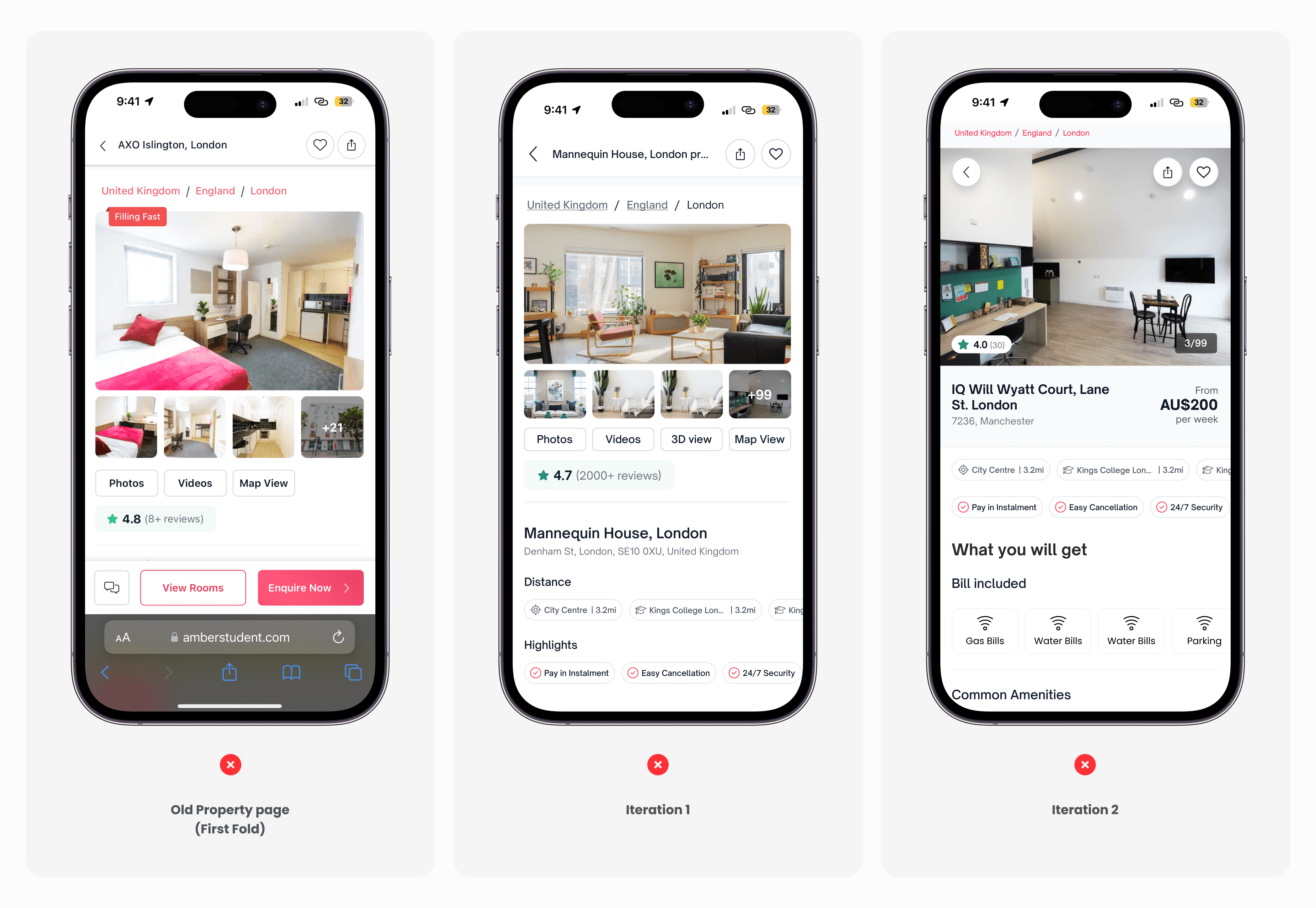
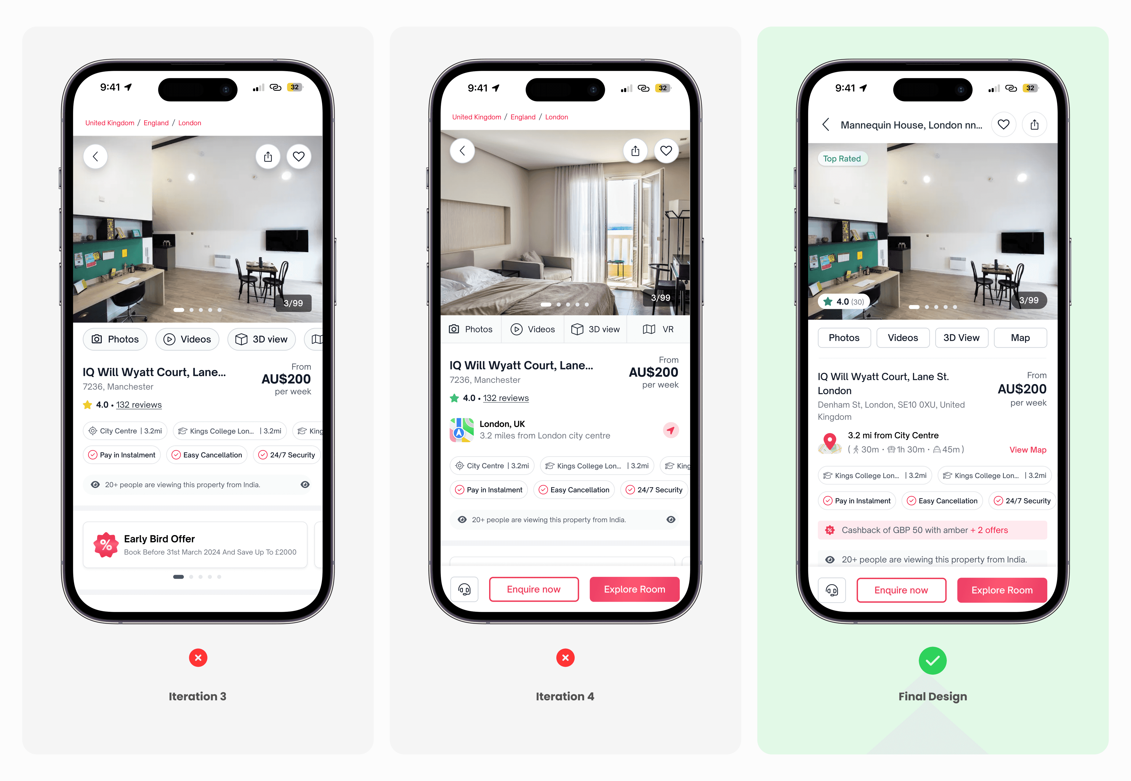
Has this design effort made things better technically and for users? You bet it has! 🙌 :
Updates to the property page made it easier for users to navigate and find crucial information. We also observed an increased number of clicks on the map and offers sections, which are key factors in their decision-making. These changes encouraged more browsing, longer site visits, and users actively scrolling to explore additional details.

