Increasing Homepage Engagement & Conversion
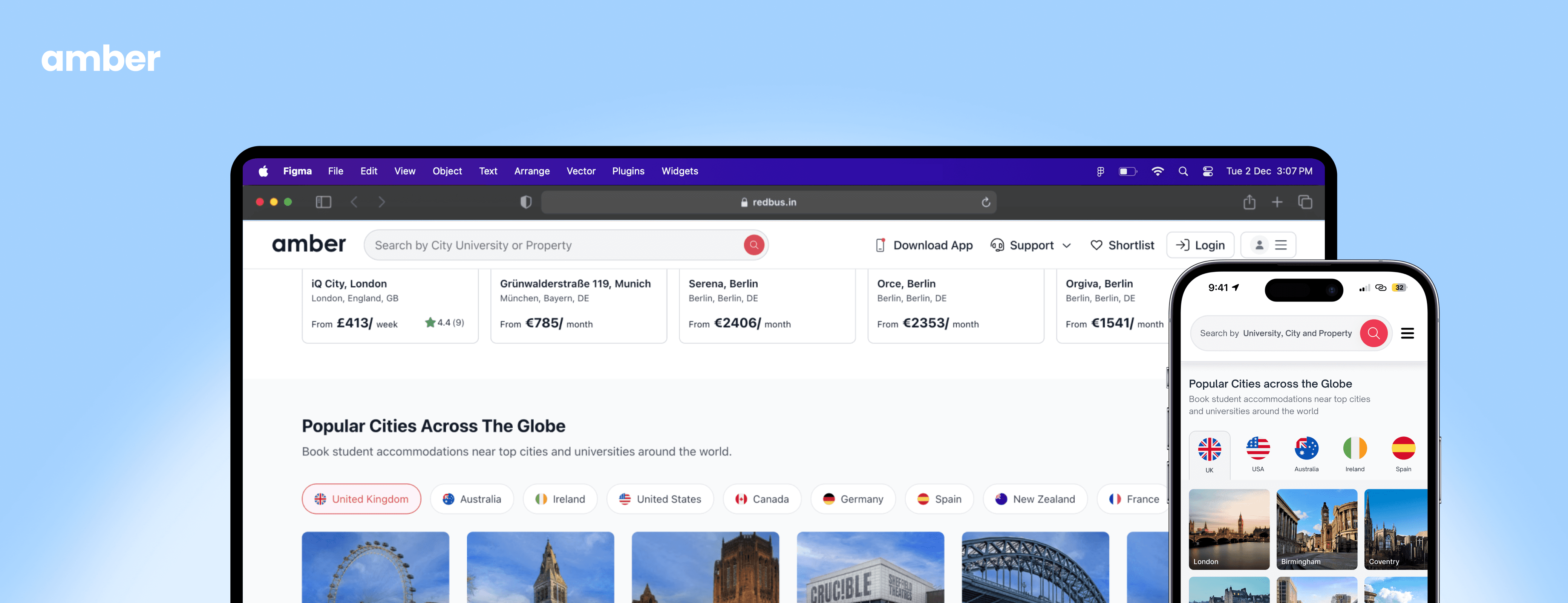
B2C
SaaS
UX Strategy
ⓘ This project is under NDA. I'd be happy to share the full story during an interview!
Problem
The homepage was content-heavy but failed to guide students especially international users - into search confidently. Key entry points (search, cities, trust signals) were visually diluted, leading to early drop-offs and low engagement with homepage-driven actions.
Impact
155.2% increase in key homepage-driven actions.
Improved engagement and reduced early drop-offs.
Clearer entry points from browsing → search → property exploration
Business Goal
Increase qualified homepage engagement and guide users more confidently into search flows.
My Role
I led homepage problem framing, user behavior analysis, layout restructuring, and heuristic analysis. I worked closely with Product and Engineering to define scope, prioritize sections, and deliver within a tight booking-season timeline.
Constraints
Tight delivery window aligned with peak booking season
Balancing existing and new design system components
BUSINESS
Business Context
Amber helps students especially international students find and book accommodation across global markets. The homepage is the primary entry point and must quickly answer three questions:
01
Communicate global coverage clearly
02
Build trust early for international users
03
Guide users into search without overwhelming them
The existing homepage struggled to answer these clearly, particularly for users unfamiliar with housing markets.
Team: PM, 1 Product Designer (me), 3 Developers, QA
Tools: Figma, Miro, Notion, Hotjar, Google Analytics
My Responsibilities
Analyzed homepage engagement and drop-off patterns
Identified key decision moments for first-time and repeat users
Defined content hierarchy and section sequencing
Designed layout, interactive patterns, and responsive behavior
Collaborated with Engineering on feasibility and rollout
RESEARCH
Core User Problems (Evidence-Based)
Using analytics, session recordings, and qualitative feedback, we identified clear behavioral patterns.
Key Observations
01
Users jumped straight to search without understanding value
02
Content below the first fold was rarely engaged
with
03
Trust and guidance content appeared too late in
the flow
Homepage explained “what Amber is” instead of helping users decide “what to do next”. These issues caused shallow engagement and early exits.

Based on the analysis of heatmap and scroll behaviour, this is a conceptual visualisation illustrating the observed concentration of user engagement around the first fold.
The redesign focused on clarity over completeness
01
Homepages are for decisions, not decoration.
02
Make trust visible before asking for action
03
Give more clarity & choice for repeat.
What We Did
What We Didn’t Do (And Why)
Strengthened core homepage discovery and trust
Did not modify the core features.
Elevated trust and social proof higher on the page
Avoided adding only testimonials (risk of overload)
Made marketing and offers more visible.
Did not remove sections critical for marketing
Visual changes focused on students.
No complete visual rebrand (out of scope)
DESIGN
Solution Overview: Homepage as a Guided Entry Point
The homepage was restructured into clear, purpose-driven sections, each answering one user question at a time.
Wireframe
Early wireframes were used to validate homepage visibility before moving into visual design. During this phase, we iterated on multiple versions based on feedback and presented them to stakeholders to align on direction early.

Above-the-Fold Redesign (Decision + Why)
Design Decision:
Strengthened visual hierarchy around search
Clarified copy for global use cases
Reduced competing CTAs

Why This Decision?
Analytics showed users made engagement decisions within seconds. The fold had to clearly answer: What is this? Can I trust it? What should I do?
Trust & Credibility Signals
Design Decision:
Added reviews and guarantees higher in the scroll hierarchy
Simplified messaging to focus on credibility, not marketing language

Students needed reassurance and trust before engaging deeply with the platform.
More visibility to the other products as well as search
What Changed
Gave more visibility to our other products, benefiting both the business and users.
Strategically placed marketing initiatives to attract and engage users
Increased visibility to allow users to search for different countries

What We Did Not Ship
Market-specific landing pages
Location-based search (live location or selected location).
These were consciously deprioritized to meet timeline and reduce risk.
Outcome
homepage-driven engagement
and early exits across key entry pages
from international traffic
Reflections:
This project really reminded me that the most impactful design work comes from observing real user behavior, not just optimizing abstract flows. By paying close attention to how first-time, repeat, and international users actually navigated the homepage and noticing where they hesitated or skipped context. I realized that the problem wasn’t missing features, but missing clarity and trust.
Translating these insights into a focused, intent-driven homepage let us remove friction without expanding the scope. What started as a small redesign ended up becoming a meaningful lever for engagement and conversion. It was a great reminder of how thoughtful, targeted UX decisions can have a much bigger impact than you might expect.
